Almost every article on this subject is a list of acronyms: AI, EPS, SVG, PNG, JPG, PDF. The list is accurate. It is also not the part that costs people money.
We design logos, so read this as interested advice. The problem we are describing is one we run into constantly: a business owner paid for a logo two or three years ago, has a PNG somewhere in an email thread, and now cannot get a sign made, cannot put the mark on a vehicle, and cannot hand it to a new designer without paying to have the whole thing drawn again. The design was never the weak point. The handover was.
So this is the handover list, a two-minute test that proves the files you were sent are genuinely what they claim to be, and the two questions - whose font is it, and who owns it - that most people only ask once the answer matters.
Vector and raster: the one distinction worth understanding
A raster file - PNG, JPG, WebP - is a fixed grid of pixels. It was saved at one size. Enlarge it and there is no extra information to draw with, so the software invents it and the edges go soft.
A vector file - SVG, EPS, AI, and most print-ready PDFs - stores the logo as maths: points, lines and curves with coordinates. There is no native size. The same file prints crisply on a business card and on the side of a building, because it is redrawn at whatever resolution the output device works in.
The consequence that catches people out is that the relationship only runs one way. A vector can be exported to any raster format in seconds. A raster cannot be turned back into a real vector automatically; somebody has to redraw it. That is why a designer who has gone quiet, taking the source files with them, is a genuine business problem rather than an inconvenience.
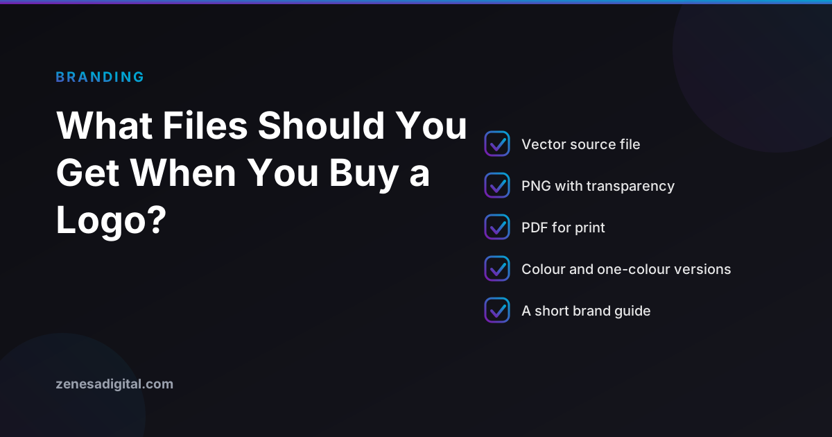
The handover list to put in writing
Ask for this before the final payment leaves your account, not after. A reasonable designer will not blink at it.
Vector masters
- The editable source file - normally a layered Adobe Illustrator (.ai) file, or a layered PDF. This is the working file, not an export. It is what lets a different designer pick the logo up later.
- EPS - the format most sign makers, embroiderers, vehicle wrappers and commercial printers still ask for by name.
- SVG - for your website, your favicon and app icons.
- A print-ready PDF - the file you can email to a printer or a trade show organiser without explaining anything.
Raster exports
- PNG with a transparent background, in two or three widths - something small for an email signature, something around 1000px wide, and one larger. Transparency is the point: a PNG with a white box baked into it is unusable over a coloured header.
- JPG - only for the systems that refuse transparency. Expect to need it occasionally.
Variants of the mark, not just one file
- The primary lockup.
- A horizontal version and a stacked version, because a website header and a square social avatar have opposite shapes.
- The standalone icon or monogram, with no words, for favicons and profile pictures.
- A one-colour black version and a one-colour white (reversed) version. These are what get used for stamps, single-colour printing, embroidery, etched signage and anything sitting on a dark background.
The colour values, written down
- HEX and RGB for screens.
- CMYK for print. Screen colour and printed ink are different systems, and a designer converting them thoughtfully gets a better result than a printer converting them automatically at midnight.
- Pantone references if you expect to print on anything other than paper.
The two-minute test: is it actually a vector?
File extensions can lie, and this is where a surprising number of cheap logo packages fall down. Two checks, neither of which needs design software.
Open the SVG in a text editor. An SVG is a text file. Right-click it and open it in Notepad or TextEdit rather than a browser. A real vector is full of tags like <path>, <circle> and <polygon> followed by long strings of coordinates. If instead you see an <image> tag containing a huge block of characters starting with data:image/png;base64, you have been sent a pixel image wrapped in an SVG container. It will behave exactly like a PNG, because that is what it is.
Zoom the PDF to 1600%. Open the print-ready PDF in any reader and zoom a long way in on a curved edge. A vector stays perfectly smooth at any magnification. A raster placed inside a PDF will pixelate or blur.
While you are zoomed in, look at the outlines themselves. Artwork that has been auto-traced from a pixel image has a giveaway signature: edges that ripple very slightly where they should be straight, and corners that are subtly rounded. It will look fine on a screen and noticeably wrong once it is three feet wide.
The question almost nobody asks: whose font is it?
Most logos are a drawn mark plus some type. That type came from a typeface somebody licensed, and typeface licences are real licences with real terms.
If your wordmark was custom-drawn, or if the type was converted to outlines - turned into shapes, so that it is no longer live text - the question mostly goes away for the logo itself. You still want to know which typeface it started from, because you will need it again for your website, your signage and your documents.
If it is live text in a commercial font, check what the licence permits. Desktop font licences from commercial foundries are typically sold per user or per workstation, and the terms vary a great deal from one foundry to the next - some address logo and trademark use explicitly, some do not. Read the licence, or ask the designer for it in writing.
Open source typefaces make this much simpler. The SIL Open Font License, which covers the majority of Google Fonts, answers the question directly: its official FAQ states that authors of OFL fonts allow you to use the font for any kind of design work, and it names logos, posters, business cards, stationery and signage among the examples. It also confirms that you remain the author and copyright holder of the graphic you create with it. The one thing the licence does restrict is selling or redistributing the font files themselves, which is not something a logo requires.
Two practical asks for your handover, then:
- Convert all type in the master file to outlines, and keep a second copy with the type still live.
- Tell me the name of every typeface used, and the licence it is covered by.
Having the files is not the same as owning the logo
This is the one that surprises people most. Receiving an .ai file is a practical fact. Owning the copyright in the design is a legal one, and in the United States the second does not follow automatically from the first. Copyright starts with the person who created the work, and a transfer has to be in writing and signed by the rights owner to be valid. A "work made for hire" line in a contract very often does not achieve this for a logo. We have written about who owns your website and brand assets after launch in detail, including the clause to ask for instead.
The short version: ask for a written assignment of copyright, effective on final payment. It is a normal request and it costs a good designer nothing.
The same caution applies to logo generators and AI logo makers. Read what the terms actually grant - some give you a licence to use a mark rather than ownership of it, and some keep the right to issue something similar to somebody else. There is also a live question about how much protection any design produced without meaningful human authorship attracts in the first place. If the logo is going to sit on your premises and your invoices for the next decade, that is worth two minutes of reading.
Where each file actually goes
- Website header - SVG, with a transparent PNG as a fallback. If you are building or rebuilding, our web design service handles this as part of the build.
- Favicon and app icon - the standalone icon version, square, legible at 32 pixels. A full horizontal lockup shrunk to favicon size becomes a grey smudge.
- Social profiles and your Google Business Profile - the square icon version again, not the wide lockup.
- Email signature - a small transparent PNG. Most email clients will not render an SVG.
- Printers, sign makers, vehicle wraps, embroidery - EPS or a CMYK print-ready PDF, plus the one-colour versions.
- Documents, quotes and slide decks - transparent PNG, and keep a JPG for anything that refuses it.
A one-page brand sheet beats a forty-page brand book
Large brand guideline documents are useful for organisations with marketing teams. For a small business, almost all the value fits on a single page, and a single page actually gets used:
- The colour values - HEX, RGB, CMYK, and any Pantone.
- The typefaces, and where they came from.
- Minimum size, and the clear space to leave around the mark.
- Which version to use on light backgrounds, dark backgrounds and single-colour printing.
- Three or four things not to do: do not stretch it, do not recolour it, do not add effects, do not rebuild it in Word.
Keep that page with the files, in a folder you control, and send it with the logo every time somebody asks for it.
What to do if all you have is a JPG
This is a common and fixable position. In order of preference:
- Ask the original designer. Even years on, many still have the working file, and many will send it. It costs one email.
- Check where else it might live - your printer, your sign maker or your previous web developer may still have the vector artwork on file.
- Have it redrawn. A designer recreates the logo as clean vector artwork from the best raster copy you have. It is a modest, one-off job, and it is the right answer if the mark is well known to your customers.
- Treat it as a prompt to redesign - but only if you were already unhappy with the logo. Losing the files is a reason to rebuild the artwork, not a reason to change your brand.
What we would steer you away from is running the JPG through an automatic tracer and calling it done. It produces artwork that looks acceptable on a screen and betrays itself at size, which is exactly when it is most visible.
What to ask for, from us or anyone else
Put the handover in the quote. Vector masters, raster exports, every variant, the colour values, the typeface names and licences, and a written assignment of copyright on final payment. If a supplier resists any of that, you have learned something useful early and cheaply.
If you are still at the budgeting stage, our guide to what logo design actually costs covers the price levels and what changes between them, and our logo design service page sets out how we work. If you would rather just ask a person, get in touch and we will answer straight.
Frequently asked questions
What logo file formats do I actually need?
A complete handover has three layers. Vector masters for anything that gets printed, cut or scaled: an editable source file (AI or a layered PDF), an EPS, and an SVG. Raster exports for everyday use: PNG with a transparent background in a few widths, plus JPG for the systems that reject transparency. And variants of each: the main lockup, a horizontal version, a stacked version, a standalone icon, and one-colour black and white versions for stamps, embroidery and dark backgrounds.
Is SVG or PNG better for a website logo?
SVG, in almost every case. It is not tied to one pixel size, so it stays sharp on a retina screen and at any header height, and the file is usually smaller than an equivalent PNG. Keep a transparent PNG as well, because some platforms, email clients and third-party tools still refuse SVG uploads for security reasons.
Can a PNG or JPG be converted into a proper vector file?
Not automatically, and not well. A person or a tracing tool has to redraw the shapes. Automatic tracers produce wobbly edges and dozens of stray points that become obvious the moment the logo is enlarged for a sign or cut into vinyl. Online converters that promise PNG to SVG in one click usually just wrap the pixel image inside an SVG container, which gains you nothing.
Do I still need the editable source file if I have SVG and EPS?
For most day-to-day use, no. You need it the first time somebody has to change something: adjust the spacing, build a new lockup for a sub-brand, or rework the mark in five years. An SVG or EPS can be edited, but the layered source file carries the structure, the named colours and the live type. Ask for it at handover rather than trying to track down the designer later.
Can I trademark a logo that uses a free font?
The font licence and the trademark are two separate questions. Fonts released under the SIL Open Font License are explicitly cleared for this kind of work - the licence FAQ names logos as an allowed use and confirms you remain the copyright holder of the graphic you create. Whether the finished mark can be registered as a trademark depends on how distinctive it is and what else is already registered in your class, not on which typeface it was set in. That part is a question for a trademark attorney.
In summary
The acronyms are the easy part. Insist on the editable source file, check that the vectors are really vectors, find out which typeface your name is set in and under what licence, and get ownership in writing before the last invoice is paid. Do those four things and the logo stays usable long after everyone involved in making it has moved on.